
Patient Appointment Details
Designing a decision architecture for clinical appointment workflows
Timeline
July - Aug 2026
Mountain View
Team
Joanna Ye, Design
Jonathon Zuniga, PM
Danny Renick, Eng
Disciplines
Research
Product Strategy
Visual Design
Tools
Figma
Claude Code
Cursor
Core Experiences
The calendar is one of Athelas Air's EHR surfaces that serves as the central source of truth for whats happening used by those responsible for ensuing the facility runs smoothly.


CUrrently…
The detail drawer has a lot of depth without a strong prioritization model.
Information wasn't necessarily missing but the current interface wasn't communicating what matters to users. What is important to the patient's current appointment and what needs attention.
CURRENT DESIGN

OnSITE RESEARCH @TIng MD Ortho Sports medicine
I conducted onsite research to understand what triggered users to open the drawer, what they looked for first, and what decisions they were trying to make.
front desk
| Eligibility, forms, balances, insurance
“Can this patient be seen, and what do I need to resolve any blockers?”
REhab Front desk
| Prior auth, visit limits, plan of care
"How many visits remain, and when do I need to take action?"
Medical assistant
| Date of birth, phone, notes
“Can I quickly get the patient context I need and continue into the note?”
REsearch synthesis
Different roles needed different information, but followed the same decision sequence.
Users weren't opening the drawer to understand everything. They were opening it to make their next decision. I realized that necessary information isn't always immediately relevant and the interface needed to reflect that distinction.
Orient
Who is this patient and what is the purpose of this visit?
Assess
Are there any blockers? Can this patient proceed?
Understand
What context do I need to understand this visit?
Act
Check in, open note, edit, send forms, or resolve any issues
WHAT WAS BREAKING THIS DECISION PATH?
Two structural problems made that sequence harder than it needed to be.
Through speaking with clinics and operations, and my research I identified key areas that I can focus on improving.

01 Data Fragmentation
Critical evidence lived outside the drawer, forcing users to leave the appointment context to verify a decision.

02 Status and Relevance
Critical blockers, unresolved states, and supporting details competed for the same visual attention.
DESIGN GOAL: Reduce decision distance
Design a decision-making surface that elevates relevant evidence and actions that helps care teams make faster decisions without leaving the calendar.
Design solution
Readiness is the entry point followed by evidence and action
The new drawer design follows a users sequence I observed in clinic onsite: establish readiness, surface the evidence behind that state, then place the next action within reach.
Improvement 1: time to value
Lead with the decision, not the underlying data
Previously, users had to interpret several independent statuses to determine whether an appointment could move forward. I brought those signals together into a clear readiness state that surfaces what matters first.
The drawer answers the user's first question before asking them to interpret the evidence behind it. "Is this patient ready for their appointment? If not, what is blocking them?"

Improvement 2: Information distance
Keep the key status visible and reveal the evidence when it's needed
Before, users had to click into links that brought them into new pages for more details. To minimize the pages that they had to click into to find relevant information, I introduced progressive disclosures that provide the key status and key actions with supporting evidence when clicked into.
Disclosure
Design Decision

3 Columns

2 Columns

2 Columns & Button
I tested different levels of density to find a balance between scanability and access to detail. The final direction keeps each section compact by default while preserving status and relevant actions at the section level.

Collapsed
Open
Improvement 3: Action hierachy
Keep primary actions in reach as the drawer grows
As the drawer became more information-dense, I explored where primary actions should live. Rather than making users scan through supporting detail, I kept appointment-level actions close to the appointment context and issue-level actions beside the status they resolve.
The exploration reinforced a broader principle: action hierarchy should follow decision hierarchy and not simply the physical length of the drawer. During onsite testing, it further validated that placing primary buttons near the top is best as it also follows users F pattern reading model.

Improvement 4: visualization
Don't make users calculate the answer themselves
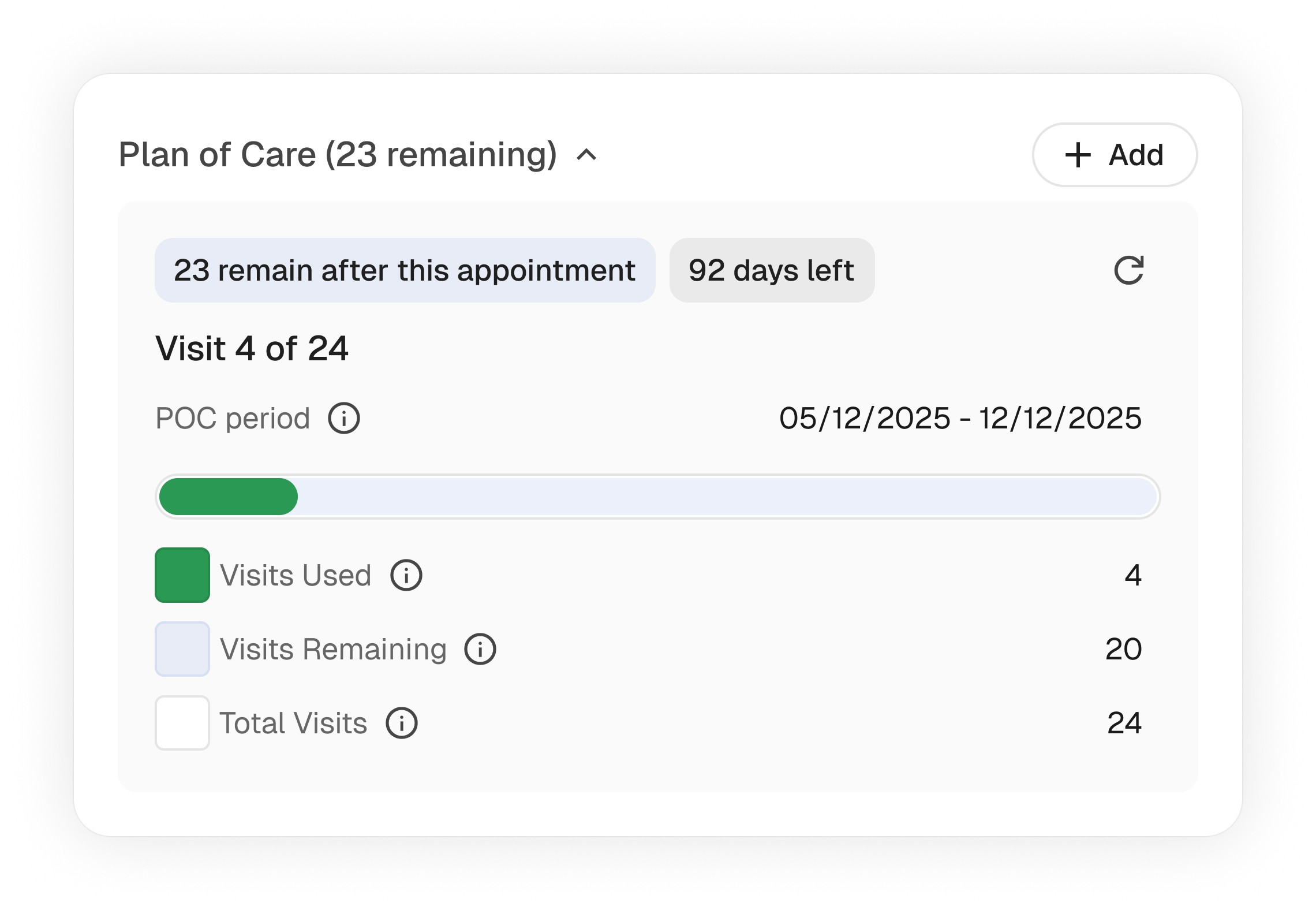
Visit limits contained the information users needed, but understanding remaining capacity still required mental math. I explored how to turn the same underlying data into a decision-ready answer without removing access to the details.
Instead of giving users the inputs to calculate an answer, the new interface gives them the answer first and keeps the underlying data available for verification along with data visualization.

Before
After
BRINGING IT TOGETHER
One predictable decision path through every appointment
Context → Readiness → Blockers → Action → Evidence
